


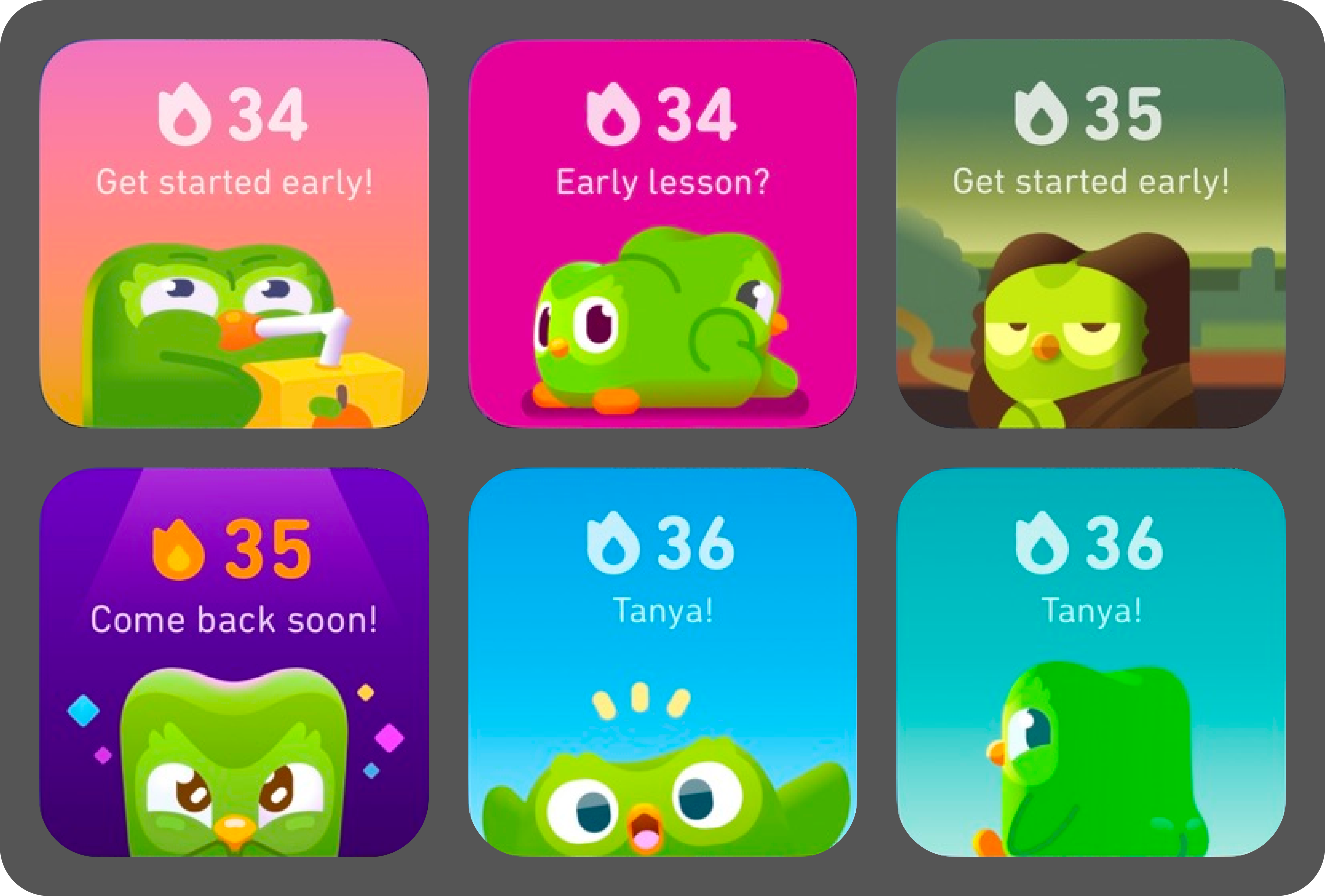
A 40-day Duolingo streak
And a few lessons in product design

It started with a chime in 2016.
I downloaded Duolingo because I was either bored or I thought I would move to France. A week later, I quit and the left lingered in my app library, ignored. Apparently, neither was a convincing enough reason for me to keep going.
Last month, I tried again. This time with lower expectations and a vague goal to brush up on French. Forty days later, I’m still here, now tapping through French, Chess and Math lessons like my life depends on it.
And somewhere between conjugating French verbs, getting outplayed by a cartoon pawn, and solving equations I barely understood in school, I started noticing something. The design of the app was doing most of the heavy lifting. Duolingo wasn’t just helping me learn. It was helping me come back. Every day. Again and again.
A surprisingly sticky blend of sound, animation, psychology, and yes, a slightly manipulative owl. But beneath the gamification and cartoon energy, Duolingo is quietly running a masterclass in behavioural design.
So this isn’t just an ode to a streak. It’s a design love letter, annotated with ideas I’d steal in a heartbeat.
Observation #1: Pavlovian pings and the power of sound
A Russian scientist rings a bell. A dog drools. We’ve all heard the story. Now replace the bell with Duolingo’s success chime and I’m the dog.
Every mistake is gently but firmly corrected with a subtle “oops” tone.
Source: Zedge
Every correct answer is followed by a cheerful little note.
Source: Zedge
That same reward chime follows you everywhere, even into push notifications. Over time, it stops being just a sound. It becomes a cue for progress, recognition, reward. And yes, it’s absolutely working. I converted to a paid plan in less than a month.
This is sound design used as UX strategy, not decoration.
Try this in your product:
Celebrate key actions with custom sound cues, like booking confirmation, a successful upload, a bill payment. Think beyond the default system “ding.” For example, Flipkart could use a celebratory sound the moment a user places an order. It’s not just about feedback, it’s closure.
Use the same sound in push notifications to build emotional continuity and reinforce brand recall.
Design for error states with audio too, not with a jarring alarm, but with something gentle and instructional. Think a banking app that uses a soft, corrective tone when a field is left incomplete rather than a red alert siren.
WhatsApp’s “swoosh” when a message sends. It’s tiny, but it completes the loop. So does Netflix’s “ta-dum.” It’s practically Pavlov for binge-watching.
Observation #2: Y2K nostalgia and delight as a design system
As a 90s kid who spent afternoons hypnotised by Cartoon Network's lineup, from Power Puff Girls to Dexter’s Laboratory and on and on, I recognise Duolingo's visual strategy immediately.
These aren’t just cute. They’re calibrated.
They're deliberately nostalgic, channeling the sassy-yet-innocent energy of our childhood cartoons. When I get something wrong, Lily frowns (but doesn’t judge). When I get something right, Eddie throws his hands up in a joy usually reserved for lottery wins. And when I finish a lesson? Fireworks. Literal, animated fireworks.
Micro-animations bring every single interaction to life, making the app feel less like software and more like Saturday morning television.
Try this in your product:
Respond to actions with emotion, not just confirmation. ****Use them to offer real-time, emotional feedback. Think frowning input fields, animated checkmarks, subtle UI shifts. For example, on a travel app, booking a flight could trigger a boarding pass animation or a mini plane flying off screen.
Don’t overdo it. Not everything needs to sparkle. But when it does, make it matter. Swiggy’s old scooter animation on order confirmation? Great. Confetti when your credit card bill is paid? Less so.
Animations are easy to build now, just use Rive or Lottielab, and start with one or two emotional cues. Make your app feel like it’s alive. Or at least, like it noticed.
Observation #3: Skeuomorphism over minimalism
The real genius of Duolingo, however, lies in their embrace of skeuomorphism, a design philosophy most apps abandoned years ago in favour of “clean” minimalism.
In digital design, skeuomorphism fell out of favour around 2013 when Apple introduced iOS 7. Suddenly, everyone was stripping away textures, shadows, and dimensional cues in pursuit of modern and minimal aesthetics. Interfaces got flat, “clean,” and emotionally vacant. And now every app looks the same. (I think minimalism killed design, but that’s a story for another day.)
Clearly Duolingo did not get the memo. Their buttons look pressable. Their icons are obvious. Their UI has dimension and depth. The app feels tactile, familiar, and even fun. Their interface is not just intuitive, it’s self-evident. You’re never wondering what does what. You just do it.
It’s not retro. It’s recognisable. It’s usability.
In his book Atomic Habits, James Clear says, “When you start a new habit, it should take less than two minutes”. Duolingo’s lessons fit the bill — short, effortless, clear. And the interface plays a big part in that. This familiarity of the interface has helped Duolingo’s users, especially those less tech-savvy, to navigate and learn everything from languages to music.

Try this in your product:
Add affordances where it matters, from buttons, toggles, and inputs to shadows, outlines, and hover states. For example, a “Pay Now” button should look like something you can actually press. Not float in a sea of whitespace like a forgotten thought.
Design for intuition, not aesthetic purity. For example, calculator apps that look like… calculators. Or payment buttons that look like buttons. You’d be shocked how many fintech apps get this wrong.
Good design doesn’t always have to be clean. Sometimes it just has to make sense.
Observation #4: Gentle parenting and the psychology of rewards
Duolingo is the world's most patient parent. You get rewards for trying. 20 gems just for showing up. XP multipliers for coming back the next day. A badge for completing a lesson, even if you bombed half of it. The owl is a relentless, enthusiastic life coach.
It’s not about performance. It’s about persistence.
Most apps only reward outcomes. But that builds pressure, not persistence. Duolingo rewards process. That builds resilience. I kept coming back even on bad days.
And that, more than any leaderboard or gem count, is what makes the experience habit-forming. It’s not just a language app. It’s an interface that treats you like a person and cheers you on.

Try this in your product:
Reward completion, not just success. For example, give users 10 points just for finishing a long form, even if they had to edit it twice. Or give users 5% off just for booking their 3rd hotel on your app, even if it’s budget.
Layer in variable rewards. A fintech app that gives surprise cash back on every third transaction. Its not every single time, but often enough to keep you interested.
Recognise streaks without making them stressful. A wellness app that says “Welcome back! Let’s pick up where we left off” instead of “You broke your 14-day streak.”
Good engagement design isn’t about tricking people into coming back. It’s about making them want to return, even when they’re not doing great.
In closing: feel something
After 40 days, I still don’t know what Duolingo’s “hearts” actually do. But I know how the app makes me feel: rewarded, encouraged, and occasionally judged by a cartoon owl.
And that’s the real trick.
Duolingo doesn’t just work because it’s useful. It works because it feels good to use. It celebrates the journey, not just the destination. And it applies behavioural design principles — sound, feedback, visual cues, reward systems — with the kind of consistency most apps only dream of.
It doesn’t take itself too seriously. But it takes you seriously. And that’s what keeps people coming back.
Maybe we could all learn a little something from that.
Even if we’re not moving to France anytime soon.
Until next time, ✌️